Prussian Blue, an iconic pigment discovered in 1704, has a rich legacy intertwined with the development of art over centuries. Artists today continue to admire and use this deep blue hue, known for its vibrant color and unique chemical properties. This blog delves into the essential insights from a recent scholarly review of Prussian Blue, highlighting key considerations for artists—ranging from the pigment’s history and chemistry to its practical applications and challenges in modern painting techniques.
An example of the use of Prussian blue pigment is in Thomas Gainsborough’s painting of Mrs. Siddons. Thomas Gainsborough (1727–1788), Title: Mrs Siddons, Portrait of Mrs. Sarah Siddons (1755-1831), 1785, oil on canvas, height: 126 cm (49.6 in); width: 99.5 cm (39.1 in), National Gallery.
Origins and Evolution of Prussian Blue
Prussian Blue was serendipitously discovered by the Berlin-based color maker Diesbach while experimenting with the oxidation of iron compounds. Initially, it found its place in European art as a replacement for more expensive blue pigments like ultramarine. By 1724, it was well established in the artistic palettes of European painters. It remained a staple pigment for artists worldwide until the late 20th century when phthalocyanine blue began to dominate.
Katsushika Hokusai’s Thirty Six Views of Mount Fuji (1830) made early and prolific use of Prussian blue, highlighted in the publisher’s advertising for the series. The now-famous Great Wave off Kanagawa was predominantly Prussian blue, with the then relatively new pigment proving particularly effective in expressing depth in water and atmospheric depth.
Despite its historic roots, Prussian Blue continues to be relevant today, not only as a pigment but also in other fields such as conservation, medicine, and industrial applications. Its persistence in art is largely due to its high tinting strength, remarkable vibrancy, and adaptability in mixing with other pigments to create a range of shades and tones.
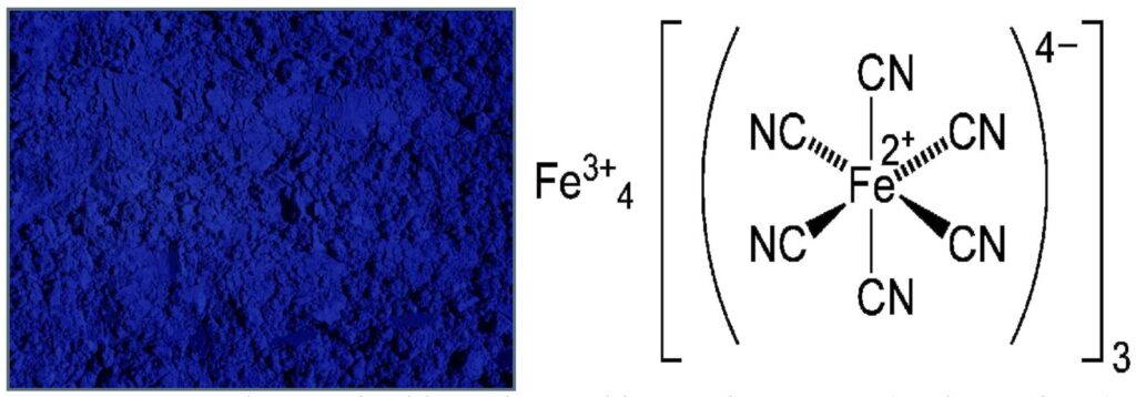
The Prussian blue color and its atomic structure (author’s figure from the article).
Chemical Properties and Colorfastness of Prussian Blue
The deep blue color of Prussian Blue is due to the electronic transitions between iron ions within its complex chemical structure. However, the pigment is sensitive to environmental conditions, which can cause issues like bronzing or discoloration over time. For example, when exposed to light and air, Prussian Blue may undergo subtle shifts in color due to changes in its refractive index, especially when viewed at glancing angles.
Artists should also be aware that Prussian Blue can exhibit undertones of red or green, depending on its preparation conditions. The pigment’s tinting strength makes it a valuable addition to any palette, but its interaction with other materials, especially whites and yellows, must be handled with care. When mixed with lead white, for example, the pigment can develop an unwanted greenish hue, a phenomenon often exacerbated by the medium’s yellowing rather than the pigment itself.
Best Practices in Handling Prussian Blue
To maintain the integrity and vibrancy of Prussian Blue, artists should follow several best practices:
Want to read the full article and unlock all resources? Choose an option below:
Varnishing watercolor has a long history—and serious risks. Learn techniques, conservation warnings, and why glazing is often the safer choice for artists.
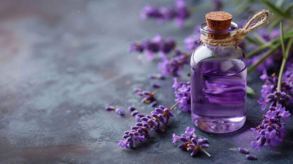
Explore how essential oils like lavender, clove, and thyme improve oil painting drying times and color retention. Learn practical applications for artists.
Painting on wood panels? Learn how plywood, MDO, and HDO boards serve as durable supports. This guide covers stability, surface prep, pros & cons, and best practices for oil, acrylic, and tempera.
Great article about Prussian blue. I think all of us artists over “a certain age” can especially enjoy it’s properties. Phthalos on my palette now, but remember it being one of the “exotic” favorite pigments back in the day. Thanks.
Thank you for this article. I’ve grown to really prefer Prussian Blue over Thalo Blue in watercolors. I was doing research on Sargent’s Venetian Watercolors and as I tried to reproduce them, Prussian Blue was usually a key color! I didn’t know that I should avoid using Lead White or Titanium White when mixing Prussian Blue in oils. Thank you for the heads up.
Embark into the epic galaxy of EVE Online. Start your journey today. Trade alongside hundreds of thousands of players worldwide. [url=https://www.eveonline.com/signup?invc=46758c20-63e3-4816-aa0e-f91cff26ade4]Begin your journey[/url]
Immerse into the expansive realm of EVE Online. Shape your destiny today. Create alongside hundreds of thousands of pilots worldwide. [url=https://www.eveonline.com/signup?invc=46758c20-63e3-4816-aa0e-f91cff26ade4]Begin your journey[/url]
Report
There was a problem reporting this post.
Block Member?
Please confirm you want to block this member.
You will no longer be able to:
See blocked member's posts
Mention this member in posts
Invite this member to groups
Message this member
Add this member as a connection
Please note:
This action will also remove this member from your connections and send a report to the site admin.
Please allow a few minutes for this process to complete.
Report
You have already reported this .
Subscribe to Our Newsletter
To begin reading the content, join thousands of artists enjoying our articles. Subscribe to receive updates on artists materials and practices.


Great article about Prussian blue. I think all of us artists over “a certain age” can especially enjoy it’s properties. Phthalos on my palette now, but remember it being one of the “exotic” favorite pigments back in the day. Thanks.
We will publish more information about Prussian Blue next month and feature more pigments in this Resource.
Thank you for this article. I’ve grown to really prefer Prussian Blue over Thalo Blue in watercolors. I was doing research on Sargent’s Venetian Watercolors and as I tried to reproduce them, Prussian Blue was usually a key color! I didn’t know that I should avoid using Lead White or Titanium White when mixing Prussian Blue in oils. Thank you for the heads up.
Very informative as always George, to better understand the properties of this magnificent color.
Embark into the epic galaxy of EVE Online. Start your journey today. Trade alongside hundreds of thousands of players worldwide. [url=https://www.eveonline.com/signup?invc=46758c20-63e3-4816-aa0e-f91cff26ade4]Begin your journey[/url]
Immerse into the expansive realm of EVE Online. Shape your destiny today. Create alongside hundreds of thousands of pilots worldwide. [url=https://www.eveonline.com/signup?invc=46758c20-63e3-4816-aa0e-f91cff26ade4]Begin your journey[/url]