Why the History of Primary Colors Matters at the Easel
Painters mixed color empirically for tens of thousands of years. No surviving evidence known to this review shows those painters organizing their palettes around a fixed three-primary doctrine. The palette of the earliest known paintings had no primary-color theory behind it that has come down to us. Painters simply ground what the earth gave them. Then they mixed by eye, by trial, and by habit passed from one workshop to the next.
The idea that red, yellow, and blue are the primary colors from which all other colors can be mixed is much younger than most studio conversations assume. It is also more contingent. The idea emerged among artists, dyers, and natural philosophers in the seventeenth century. It then hardened into doctrine over the following two centuries. By the late nineteenth century, color science had shown that cyan-, magenta-, and yellow-leaning colorants form a more efficient subtractive model, under specific assumptions about transparent inks and filters, than red, yellow, and blue do. That did not make red, yellow, and blue useless for painters. It meant the triad could no longer be defended as the physically optimal one, decades before it became a fixture of twentieth-century art education anyway. Painters today mostly inherited the doctrine. Few inherited the correction, or the caveats around it.
This review draws out three separate questions that get run together whenever this topic comes up: what people call colors, what an idealized subtractive mixing system needs to reproduce the widest range of hues, and how actual artists’ paints, which are opaque, scattering, particulate materials, behave on a palette. Confusing those three questions is a large part of why the subject stays muddled. The rest of this review keeps them apart on purpose.
That gap is the actual story. It matters at the easel because it changes what a three-color triad can reasonably be asked to do. It also changes how much weight to put on a paint tube’s color name. This review is a history of primary colors: where red-yellow-blue came from, where cyan-magenta-yellow came from, and why the older, less complete model is still what most art students learn first.
An Empirical Tradition Older Than Primary Colors
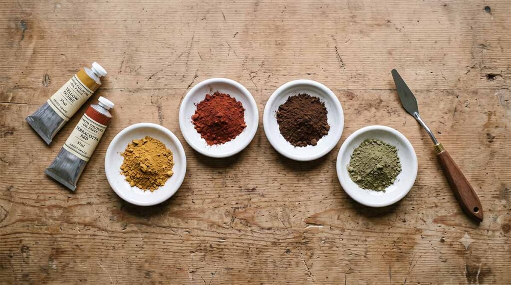
Ochre is among the oldest pigments used by humans. It appears in archaeological contexts many tens of thousands of years old, long before any theory of primary colors existed to explain why it worked. Painters reached for iron-oxide earths — yellow ochres, red ochres, siennas, umbers — because those pigments gave a painting the muted, structurally stable color it needed. They did not reach for earths because the pigments fit into a three-color system. No such system existed yet.
That history matters for how the rest of this review should be read. Earth pigments were not historically justified by primary-color theory. François d’Aguilon, Roger de Piles, and Jacob Christoph Le Blon built their three-primitive idea from saturated, reddish, yellowish, and bluish colorants, not from ochres and umbers, so earths were never conceived as members of that set. A painter can certainly put a yellow ochre to work as a subdued yellow within an RYB-style mix; that is a real and useful practical option, and this review returns to it later. But earths do not depend on primary-color doctrine to earn their place on a palette. A sister article on this site examines how market language around earth pigments — “raw sienna,” “burnt umber,” “yellow ochre” — functions as a category label rather than a strict guarantee of composition. The same historical point applies here from the other direction: earth pigments carry their low-chroma, high-permanence character directly, whether or not anyone has a theory of primaries to justify it.





I enjoyed this very much! I also favour the explanation given by Dodgson and gave a similar explanation myself framed in terms of the theory of red, yellow, green and blue unique hues in my presentation at the Munsell 2018 conference in Boston. I revisited this in a recent conference presentation on my YouTube account and in a chapter in a book coming out later this year.
https://www.iscc-archive.org/Munsell2018_Presentations/Briggs-Presentation-WhereIsColourEducationNow.pdf
With regard to Kubelka-Munk, the program drop2color by Zsolt Kovacs calculates mixing paths using this model and the results consistently confirm that paints close to C, M and Y in hue show a different pattern of mixing paths compared to paints far from those hues (e.g. slides 29-30 in the above pdf).