Spanning the early decades of the 18th century, the Rococo or Late Baroque era reflects a continuation and expansion of the vivid colors and ornate details first seen in the Early Baroque or Cavalier period (circa 1610-1650). Its peak was seen predominantly in Catholic regions such as France, Austria, and Bavaria, contrasting with a more subdued expression in Protestant areas, including England, Germany, the Netherlands, and Scandinavia. France remained the epicenter of European culture during this time, with the era marked by the opulent rule of Louis XV (1710-1774) and his influential consorts. The term “Baroque” derives from a Portuguese word for ‘misshapen pearl,’ while “Rococo,” or rocaille in French, signifies ‘resembling a shell.’
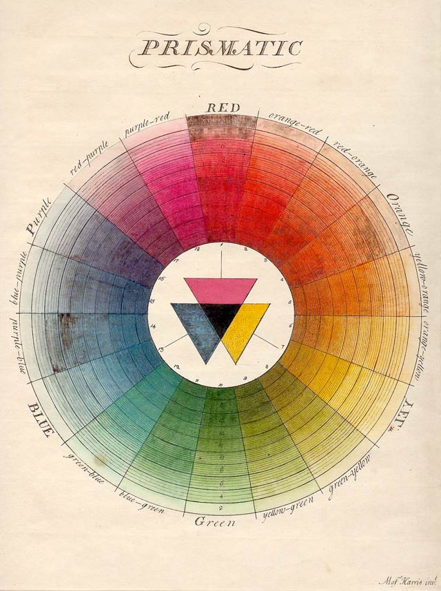
Prismatic Colour Wheel From Moses Harris (1730 – c. 1788) (artist/printmaker), The natural system of colours, London [c. 1785], Hand-coloured etching
During the Rococo era, there was a moment when it seemed artists might altogether forego the use of earth tones, as exemplified by William Hogarth’s Analysis of Beauty (1753). This period saw a shift in traditional color usage, influenced by contemporary science claiming to utilize Isaac Newton’s color theories in painting, now referred to as ‘colorful mimicry of nature.’ Although these new approaches were often based on color effects long known to artists, the period was marked by a notable shift towards a spectrum of vibrant colors in Rococo art. This shift laid the groundwork for the rich realism found in French Impressionist works a century later, despite the initial skepticism towards abandoning traditional earth pigments.
Jean-Antoine Watteau, The Feast (or Festival) of Love, 1718–1719, oil on canvas, 610 mm × 750 mm (24.01 in × 29.52 in), Gemäldegalerie Alte Meister (Dresden)
Contrary to the trend among some Rococo artists to minimize their use, the four classical earth colors maintained their significance in the artist’s palette, especially for mixing flesh tones and creating delicate foundational colors for highlights. For instance, Jean-Antoine Watteau’s paintings, with their ethereal atmospheres, owe part of their charm to his use of contrasting color patches and nuanced brushstrokes, building on a classical underpinning of optical grays and browns. Watteau’s artistic legacy also includes influences from earlier masters like Rubens and, by extension, Titian, which is especially evident in his handling of paint and glazing techniques.
In the realm of color theory, the early 18th century saw significant developments, such as C.T. Barthold’s advocacy for the red-yellow-blue primary color system in 1703 and the comprehensive listing of artists’ pigments by John Harris in 1704. Jean-Baptiste Oudry’s 1752 lecture to the French Academy suggested a methodical approach to color usage, advocating for a palette that included pre-mixed shades arranged in a tonal sequence. This period also witnessed a bold use of color in the works of Nicholas Lancret and Quentin de la Tour, whose pastel mediums allowed for the delicate rendering of their subjects, inspired by the luminous quality of certain wines.
Rosalba Carriera, Portrait of a Woman with Mask, Fondazione Cariplo
Rosalba Carriera stands out as an early proponent of pastel drawing, setting a precedent for artists like Quentin de la Tour and Jean-Baptiste Peronneau. The pastel medium, similar to watercolor but applied dry, allowed for subtle blending and delicate effects, particularly suited to depicting human skin.
Further contributions to art practice include Johann Melchior Cröker’s guidance on preserving oil paints and the continued use of traditional palette shapes. Diesbach’s discovery of Prussian blue in 1704 in Berlin marked a significant advancement in pigment availability, offering artists a stable, affordable blue that had a profound impact on the color palettes of the time.
Want to read the full article and unlock all resources? Choose an option below:
Water gilding gesso and bole, decoded from Portuguese Baroque treatises and laboratory reconstruction. Practical guidance for artists who want recipes that work.
Painting on wood panels? Learn how plywood, MDO, and HDO boards serve as durable supports. This guide covers stability, surface prep, pros & cons, and best practices for oil, acrylic, and tempera.
Explore the 18th-century painting palette. Learn the organization of the artist’s palette, the strategic use of pigments, and the design of painting implements that defined this era of artistic innovation. Learn how masters like Chardin and Van Loo navigated the guidelines of the French Academy to create timeless works.
Embark into the expansive realm of EVE Online. Become a legend today. Trade alongside thousands of explorers worldwide. [url=https://www.eveonline.com/signup?invc=46758c20-63e3-4816-aa0e-f91cff26ade4]Play for free[/url]
Report
There was a problem reporting this post.
Block Member?
Please confirm you want to block this member.
You will no longer be able to:
See blocked member's posts
Mention this member in posts
Invite this member to groups
Message this member
Add this member as a connection
Please note:
This action will also remove this member from your connections and send a report to the site admin.
Please allow a few minutes for this process to complete.
Report
You have already reported this .
Subscribe to Our Newsletter
To begin reading the content, join thousands of artists enjoying our articles. Subscribe to receive updates on artists materials and practices.


Embark into the expansive realm of EVE Online. Become a legend today. Trade alongside thousands of explorers worldwide. [url=https://www.eveonline.com/signup?invc=46758c20-63e3-4816-aa0e-f91cff26ade4]Play for free[/url]