Vermilion and Chinese Vermilion

  • Vermilion and Chinese Vermilion

    Posted by James on October 26, 2024 at 3:23 pm

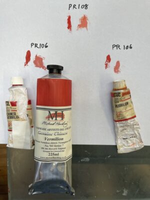
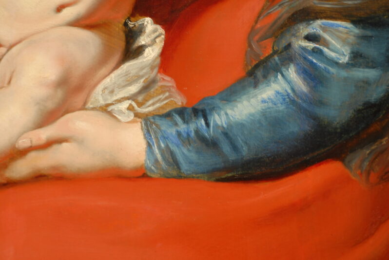
    I asked a question about the difference between the paints “Vermilion” and “Chinese Vermilion” in today’s Cohorts Zoom meeting. I attached a photo of both of these paints, which are labeled PR 106. The “Chinese Vermilion” by both Holbein and Michael Harding is a darker hue and tints a bit grayer than the Holbein “Vermilion.” Above is a cadmium red light, PR 108. All tints were made with flake white, and the vermilions create cooler tints than the cadmium. The photo doesn’t due justice to the appearance of the hue in life: The vermilion really appears a touch more “orangey” than the cadmium in life.

    jan replied 1 year, 5 months ago 2 Members · 6 Replies
  • 6 Replies
  • jan

    Member
    October 26, 2024 at 4:47 pm

    James, thanks for posting yr swatches. Was considering buying the Holbein Vermilion but hesitated at the $50 price. So after seeing yr mixes I experimented and came up with something fairly close (for my standards anyway)

    • jan

      Member
      October 26, 2024 at 4:52 pm

      And, with a little more rose to the mix:

    • James

      Member
      October 26, 2024 at 6:42 pm

      Thanks, Jan! I bought these a while ago when I got a good deal on a sale. Yes, I also have your pigments and appreciate knowing your mixes. Unfortunately, my photo doesn’t really capture the true color of the Vermilion, which has a hint of yellow in it. I bought these when I was doing a Rubens copy and found them the best way to get to the reds he used. It is a unique pigment and wish it were more available at a decent price.

      • jan

        Member
        October 27, 2024 at 3:36 pm

        Were u doing a portrait? I keep thinking this would be a nice mix for skin. Rob Liberace uses Vermilion. I have issue with my photo too. Doesn’t reproduce the chroma of the mix I made, and wants to lighten my swatches. But then am using an old ipad. You’d think after 180 years photography would be a little more artist friendly. Ha!

        • James

          Member
          October 29, 2024 at 3:22 pm

          I was painting a copy years ago at the Art Institute of Chicago of the Holy Family. I used the vermilion(s) mainly for the red skirt in the center of the painting. It has that distinctive slight “orange” cast, which is particularly nice when glazing over with a darker, cooler madder for modeling, as Rubens did. I may have used vermilion in the flesh tones in top layers of the Madonna and children. Currently, I don’t use vermilion that much — I often start with the great red earths that George sells. I may use a touch of vermilion in upper layers for cheeks, lips, fingers and toes. One color I’ve become accustomed to using in my flesh tones is Naples Yellow, deep. I hope that color remains available for artists too!

          • jan

            Member
            November 8, 2024 at 8:52 am

            Your copy? Lovely! I just did a Vermeer copy (Milkmaid). Used a limited palette (cyan, magenta, lemon). Came out OK but plan to redo using Vermeer’s fuller palette that included an earth color. Been loving using Rublev’s umbers lately, such fun, so many!

Log in to reply.