jan
MemberForum Replies Created
-
Hi Stephen,
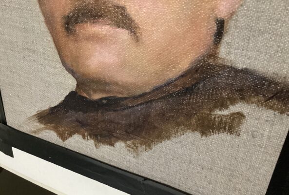
I know what you’re trying to do in exploring oils and in my experience, letting it dry is the best approach to “isolate” as you say. On a dry piece you can apply VERY thin glazes to alter a color. You can add an object without ruining what ‘s already there. If you don’t like, just wipe it away. To be more drastic you can sand the piece or just a small area of the piece to improve something like “edges”. But make sure it’s real dry and do it outside or with filtration. Sanding leaves a ghost image if done strongly which can often foster creativity in a new direction. You can sand into a “couch”, that is apply a thin coat of something like Oleogel and sand on that, this mitigates some dust if you’re indoors and in my experience I like the way the new paint application “adheres”. Always wipe/clean yr piece down well after sanding. Sanding works best on a firm substrate, not so good on stretched canvas. This reworking of an oil painting is common to many artists which is why they often have 2 or 3 or more paintings underway in the studio, giving some a chance to dry. Another option to explore is taking a photo of yr work, put it in a program like Procreate or Photoshop and manipulate the image. Then incorporate the changes on the actual ptng with paint. (Saves on paint anyway). An old but easy way is to place a piece of clear acetate over a dry ptng and paint changes on top of that to experiment, If you don’t like, wipe away. Have fun, reworking is a time honored tradition in oil painting.
-
Stephen, I’ve seen provenance sheets glued to the protective backing so it can be read by just flipping the ptng around. Also, most artists I know will sign & write some brief info on the stretcher bar or back of solid substrate with a marker, this may or may not be visible depending on protective backing used. Also, if you flip some older ptngs around you may see a plethora of labels, glued to back if the ptng has been in a lot of shows or sold and resold often. Galleries like to afix their info to ptngs in their possession. Cheers, J
-
Stephen, after you’ve taken steps to protect yr work, don’t forget to attach a “Certificate of Authenticity” to the back. This is appreciated by collectors and will aid “Provenance”. There are examples around the net, but it should at least include Title, Year, Medium, Dimensions, your name and signature. Nice additions could be a small color picture of the work, your web address and something similar to “This certifies an original artwork . . . reproduction rights retained by artist”. You can make 2 copies of this “Certificate” and keep one. Makes record keeping easier.
-
James, thanks for posting this. The Titanium Zinc would definitely be a deal breaker for me. I saw a lovely painting in a museum wherein the artist used a titanium zinc white, all the light passages are cracking even tho it’s a fairly recent work. So sad.
-
OOPS: Sorry. that was a typo. Senso’s product says “Universal Acrylic Primer”. So is Acrylic Primer the same as acrylic polymer?

-
Great recommendations Tatiana, especially like the toothbrush idea. I follow all yr points but sometimes get exuberant and paint ends up at the ferrule. Your toothbrush idea may help me with this. Thanks. BTW I buy safflower oil in large glass bottles from the grocery and it works wonderful for cleaning, then do the soap & water. 🤗
-
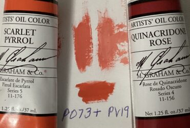
James, thanks for posting yr swatches. Was considering buying the Holbein Vermilion but hesitated at the $50 price. So after seeing yr mixes I experimented and came up with something fairly close (for my standards anyway)
-
And, with a little more rose to the mix:
-
-
Hi Connie, thought I’d throw my 2 cents in since I have a lot of umbers in my stash. When I purchase a new color I always do a swatch: Neat, rubbed off and tint with titanium. A while back was looking for a raw umber that leaned warm/yellow instead of cool gray and ended up with 9 brands! Of the tubes I amassed Michael Harding sunk in the least, followed by Van Gogh, Old Holland, then Blue Ridge, the remaining 5 sunk in noticeably. Most were PBr7 a couple PBr6. Swatches were on a canvas pad (like a coated paper). All the burnt umbers sunk, cept the Van Gogh not so much. Didn’t try a Rublev, MH or OH. I actually use a PR101, Like transparent oxide brown, instead of burnt umber. Doesn’t sink and nicely transparent. All my raw siennas, asphaltums, van dyke brown, cassel earth, and warm sepia sunk. I wonder if some brands don’t add wax, oil, or some additive that prevents sinking?? (MH, VG??) Never had an issue with umbers cracking. I paint thinly usually. Hope this helps a little. Good luck in yr quest.
-
Absolutely, it is my step just before final soap and water.
-
Thanks George, for understanding my confusion and clearing this up.
-
Your copy? Lovely! I just did a Vermeer copy (Milkmaid). Used a limited palette (cyan, magenta, lemon). Came out OK but plan to redo using Vermeer’s fuller palette that included an earth color. Been loving using Rublev’s umbers lately, such fun, so many!
-
Were u doing a portrait? I keep thinking this would be a nice mix for skin. Rob Liberace uses Vermilion. I have issue with my photo too. Doesn’t reproduce the chroma of the mix I made, and wants to lighten my swatches. But then am using an old ipad. You’d think after 180 years photography would be a little more artist friendly. Ha!
-
Enjoyed reading your opinions. I, on the other hand love Rublev’s Cyprus Umber Light. It leans a warm yellow, almost a very dark raw sienna. I use it as my low chroma yellow. Keeps its warmth even when tinted out with titanium. The French Umber goes a little too gray for my tastes. Like Rublev’s other earth colors they handle like real pigments, not plastics! 😁
Amazes me how so many different variations can be had from PBr7.